
Live illustration: learning for visual brains
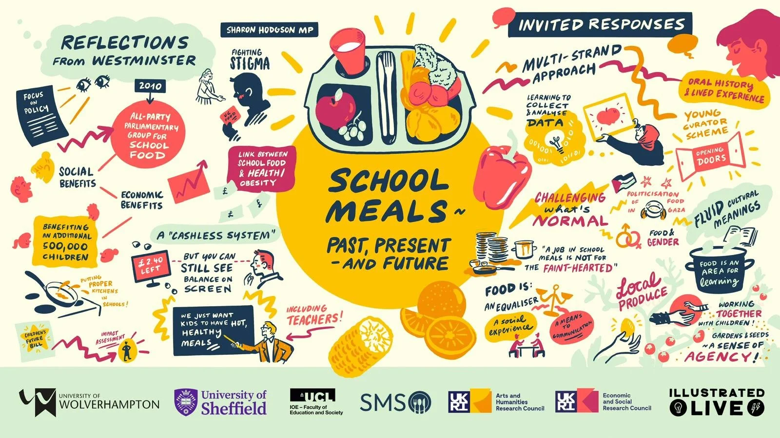
Our scribing from a ‘School Meals’ event earlier this year, keeping with the back-to-school theme of today’s blog!
September’s got us thinking about live illustration and the back-to-school rush…
The untouched notepads waiting for fresh scribbles. The whiff of your fancy new pencil case. The funky pens and pencils you filled it with (and HOPED that the person sitting next to you would NOT ask to borrow because you let them borrow your fine liners last year and they snapped all the nibs because they pressed too hard and you’re STILL thinking about it in your thirties…) Oops. Sorry. I’M FINE, I SWEAR. 😆
A better point to make would be…
Remember when you colour-coded your notes at school and suddenly the topic actually made sense? Or when a doodle in the margin helped you recall an entire chapter in an exam? Oooh, and those squiggly mind maps we used to draw to lay out all the most important information in a fun way?
Turns out, we were onto something.
Colour, shape, and imagery create stronger memory anchors - even for those of us who are convinced we’re not creative! And this is why live event illustration is the ultimate grown-up upgrade to this visual approach.
Yes, yes, yes, we’re all adults now, and a lot of us have job titles which would have intimidated our little school ears to hear. But just because we’re grown up now doesn’t mean that everything we do in the office, at an event, in a training session or wherever else our career cogs twirl needs to be serious, complicated to understand and full of language that makes you wish you actually were back at school doodling in the margins.
So why not let your audience feel a little bit like they’ve rediscovered a superpower they forgot they had? Give them the gift of understanding your event content in a way which makes them feel immense, not tense!
To paint it more clearly, let’s play a quick game…
This or that!
A 60-page plain text document recap OR an illustrated summary like our picture above?
A 2-hour webinar recording with no time stamps for the highlights OR an illustrated summary like our picture above?
ALL OF THE JARGON with no context OR an illustrated summary like the picture above, where the jargon comes with characters, quotes and stories?
See where we’re going with this? Don’t just take our word for it though. It’s happy clients who prove that a more creative approach to capturing events is a smart move.
Here’s what our lovely client from the school meals event (pictured above) had to say:
“I have no idea you managed to get so much out of the session! There's been a big round of applause for you here!”
Looking for a round of applause at your next event? Slink yourself into our inbox and we’ll see what we can do together!
x Illustrated Live